In Suburbia is the third comic for myself, and for Olive. I swear it feels like I’ve done more than fifteen pages of comic, but here we are. I’m still deep in the weeds here, learning my craft, figuring out what my process is. El and I have Britain A Prophecy on the horizon, and largely all of the Olive pieces have been about me learning what I need to know to do comics at that scale.
So to that end, each Olive piece has, stylistically, been very different from the others. Each piece, I feel like I’m honing in on what I like and do not like about each process I try. And I am getting faster, and more consistent. I’m learning how to abstract more, and when I can push realism just a little farther. I’m trying things and letting my process grow and shift underneath me.
Which if that sounds vaguely exhausting… it is.
For In Suburbia I was trialing an uninked pencils style, and the blocked out shading style you see on page 1 very quickly evolves into a more rendered style that you see by page 5. Ultimately, I decided to let the style shift more on this piece than I had been allowing in the previous two Olive comics, given that this is a pretty good contender for the style I end up perfecting for Britain a Prophecy.
I think in the end I want to have more lines. More sketching, and more.. mm.. something. I’ve got some single panel Olive pieces coming up that I am going to test some thoughts I have about this style out on. I’ll be posting them on my Twitter as I make them, and collecting them here after, so feel free to follow along on that journey.
As for the lettering choices in this one, I went back to a more traditional pointed balloon tail from the odd blunted ones I was trying out in Hootenanny, but I kept the playfulness of the shape. I largely like what I’ve come up with here. I think it works very well for Olive, but will sadly not be going on to be used in Britain a Prophecy. It feels like a comedy comic convention. So much about lettering comes down to how does it /feel/ in the end, and I’m pretty delighted to have gotten to do these this way.
1 Personal Reasons
This comic is wall to wall absurdism. Olive, who we’ve established as this trickster, getting themselves into and out of trouble in grand ways is absolutely out of place in their parent’s suburban home. Fairy, but make it mundane as heck. Olive, but off balance.
This page gave me a few really fun opportunities to play with lettering. Between the alphabet magnets, the news paper, and having Olive’s mother literally talk over her child in the 8th panel, this page was a blast to letter.
The title panel as alphabet magnets was my addition to the script, and a lot harder to get right than I expected. Peaseblossom is… a long name, y’all. But it was absolutely worth it, I love that panel.
If you want to see a call back, please enjoy the Hive City Honey jar on the counter. I love a good call back.
Also please spent a moment and enjoy that news paper. I had so much fun solving that problem, and delighted in getting to text El to ask her for a pull quote from the article.
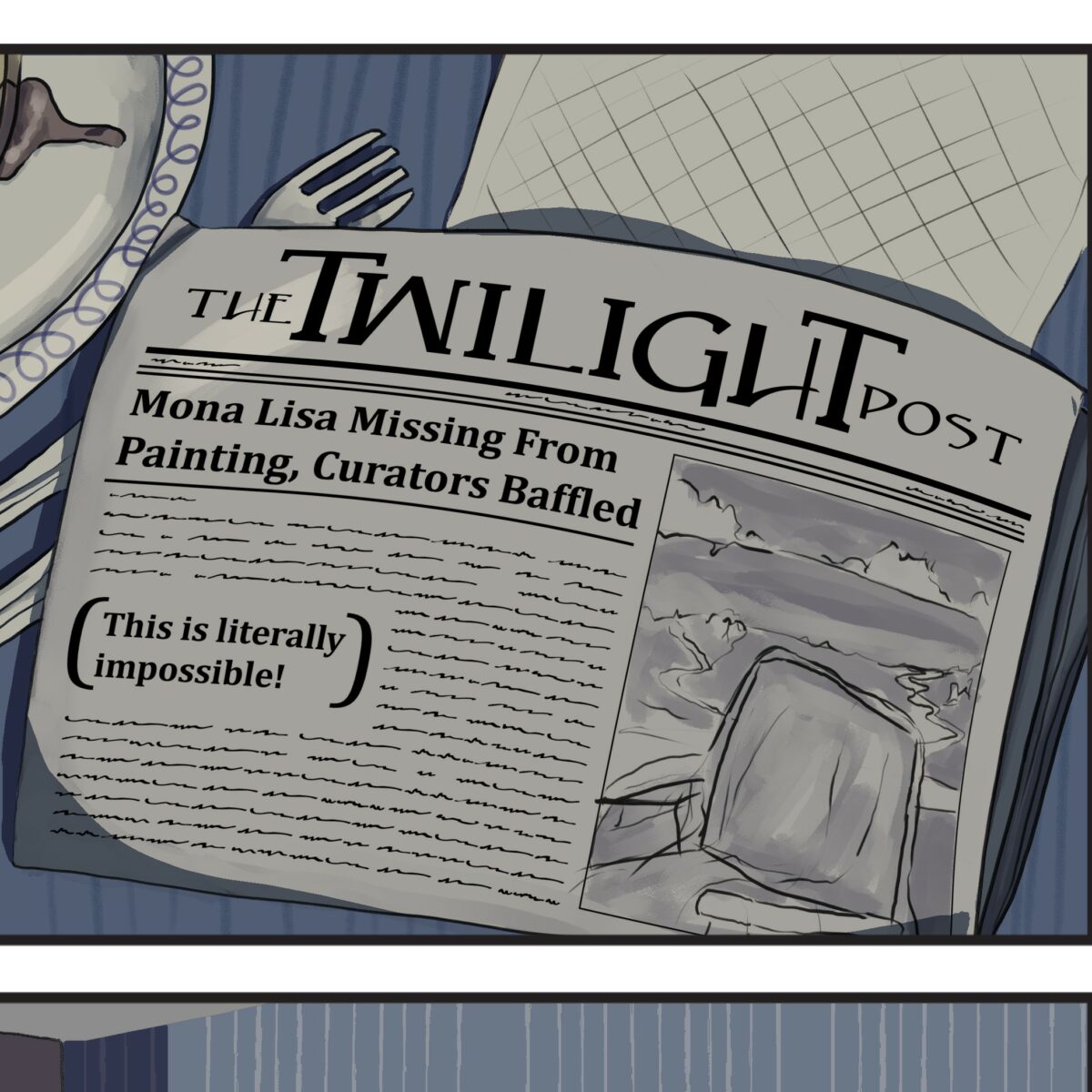
This is Literally Impossible 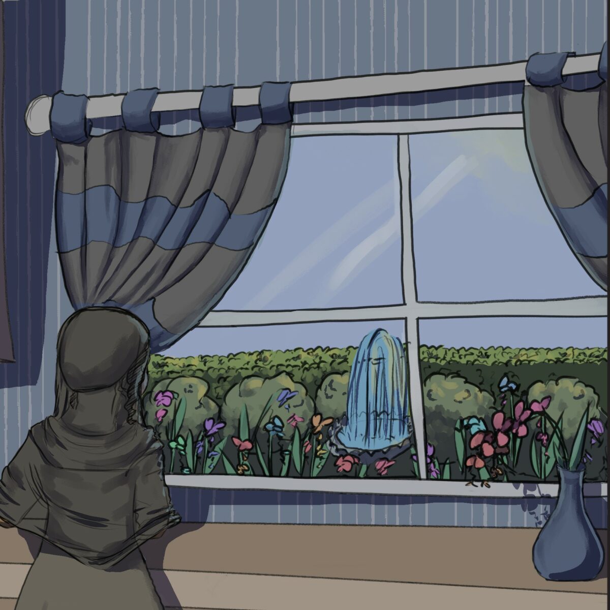
Glitter Orchids, are of course, orchids that produce glitter 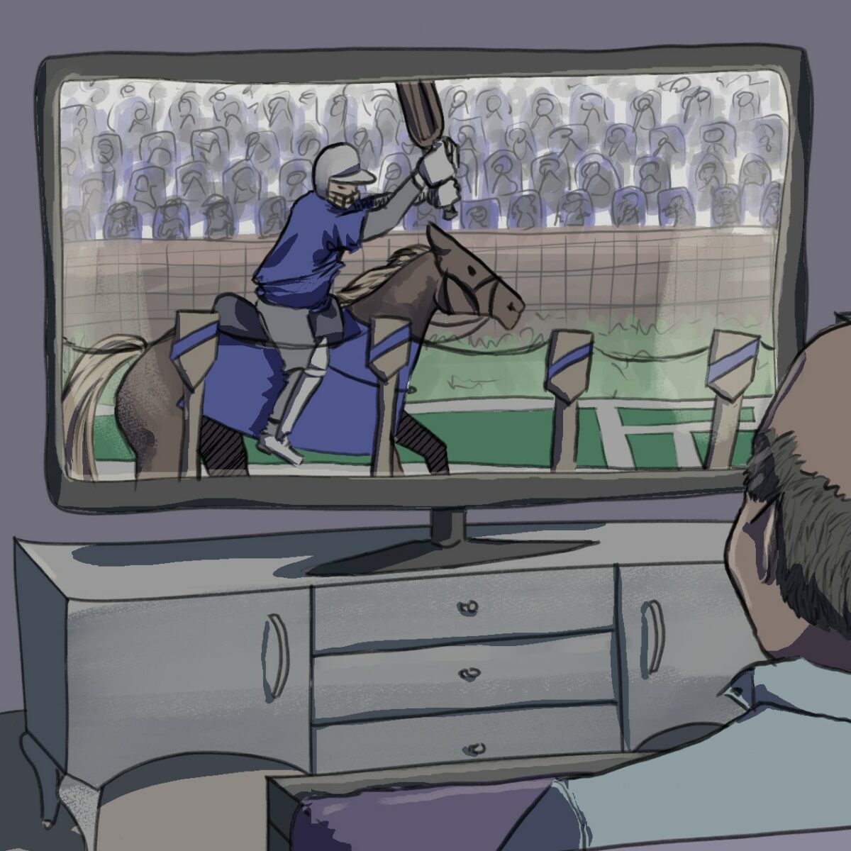
Fancy a game of Cricket Jousting?
2 This is no time for clever schemes…
I’ve started moving away from the harder edges dominating the coloring here, giving in to my instincts to brush strokes. I was still drawing them hard here, and softening. Later, I swap that order, soft shade in everything, and add hard edges where I want them.
Olive’s poor resigned face when they realize they’re going to have to fix this problem for their mother.
You get the best look at Olive’s tee shirt in this page. Cold Iron is the metal band for which Olive has a poster hanging in their apartment in literally the first panel of the first Olive piece. Even though they are basically covering up the name of the band there, I had designed the logo, and we decided it would be fun to use again here.
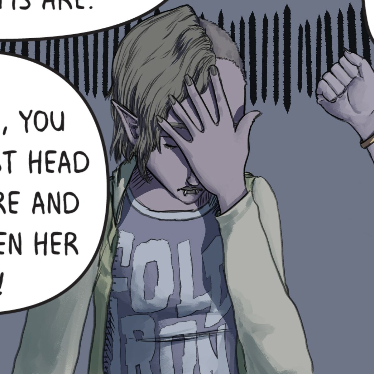
Cold Iron 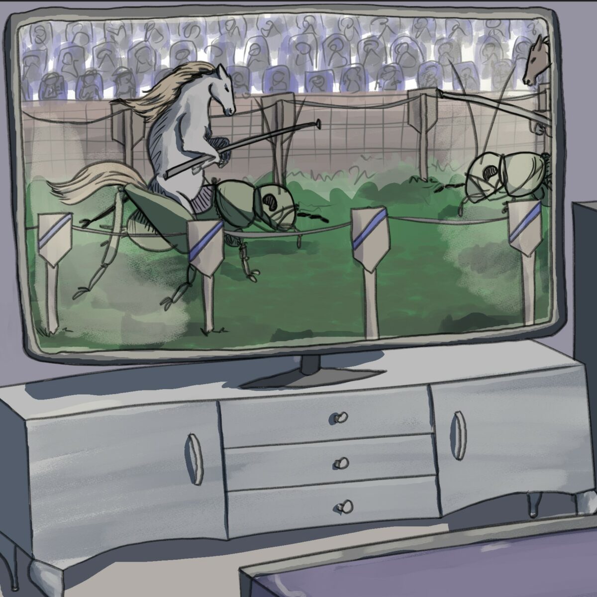
Fancy a game of Cricket… Jousting? 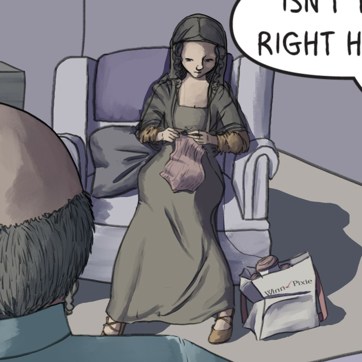
Knit 2 Purl 2 Knit 2 Purl 2
3 A montage of theft
this page. took forever to design. I came to the gag of all the houses being literally identical halfway through the process, too, and ended up having to redesign poor Mx. Garlicwax’s dining room to have the right window and angle of shot. RIP an actually pretty good panel.
We originally had the second column of panels with full gardens, and the third column with empty windows, and Olive’s neighbors looking out, but I wanted to get their faces, and I found the red panel with lines language very funny to disrupt for Garlicwax’s confusion.
The Owl bears were a request. They are legitimately one of my favorite critters, and the Olive in Panel 2 is probably my favorite drawing of them I’ve done to date. The owl bears, of course, represent all of the possible pet emotions. “Weeeeee MOUSIE,” “Why not hug baby???” “I will murder you,” and of course “How DARE?”
Another thing I enjoy here, is Mona in panel 7 repeating the gesture she learned from watching Olive comfort their mother a page before.
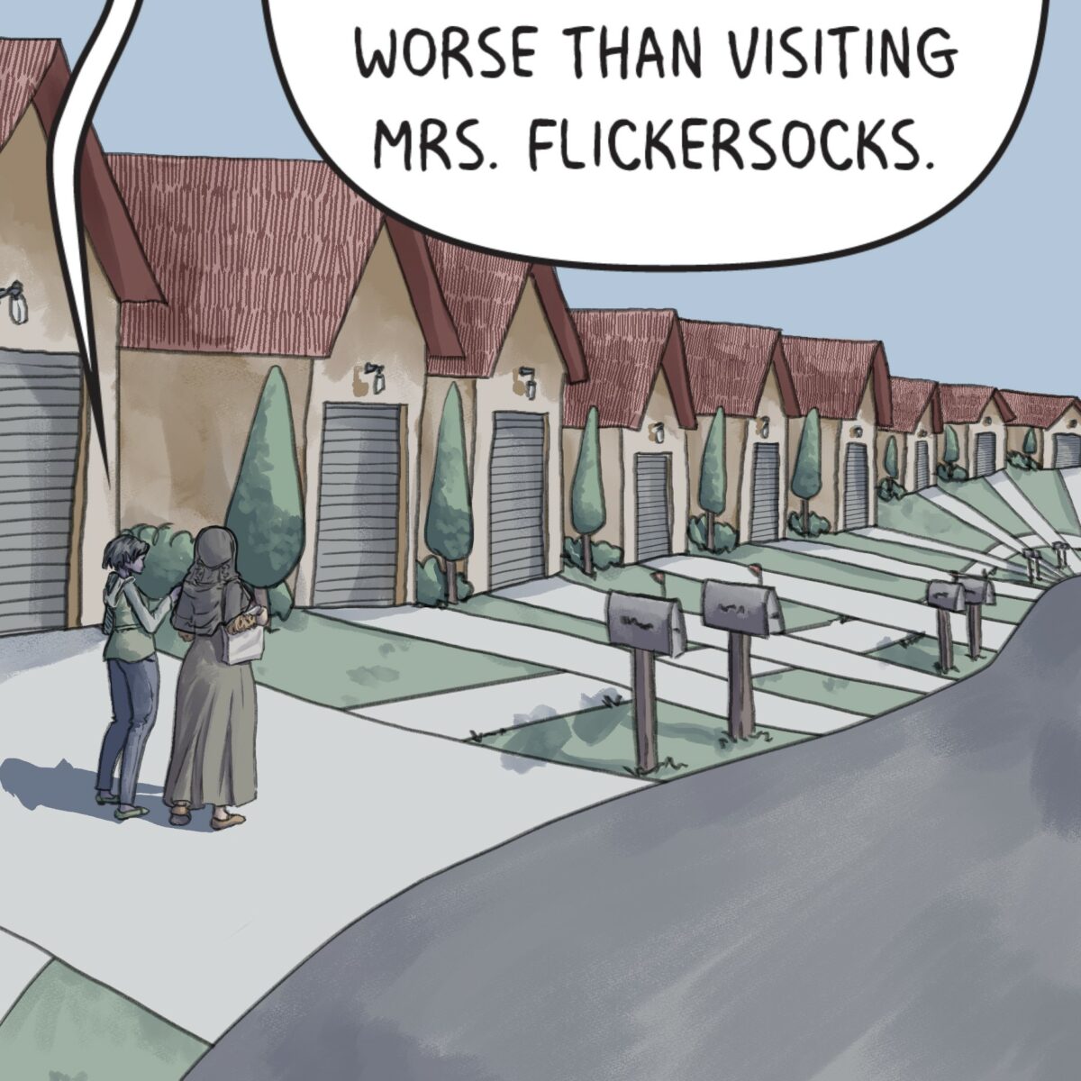
One assumes the street goes on forever. 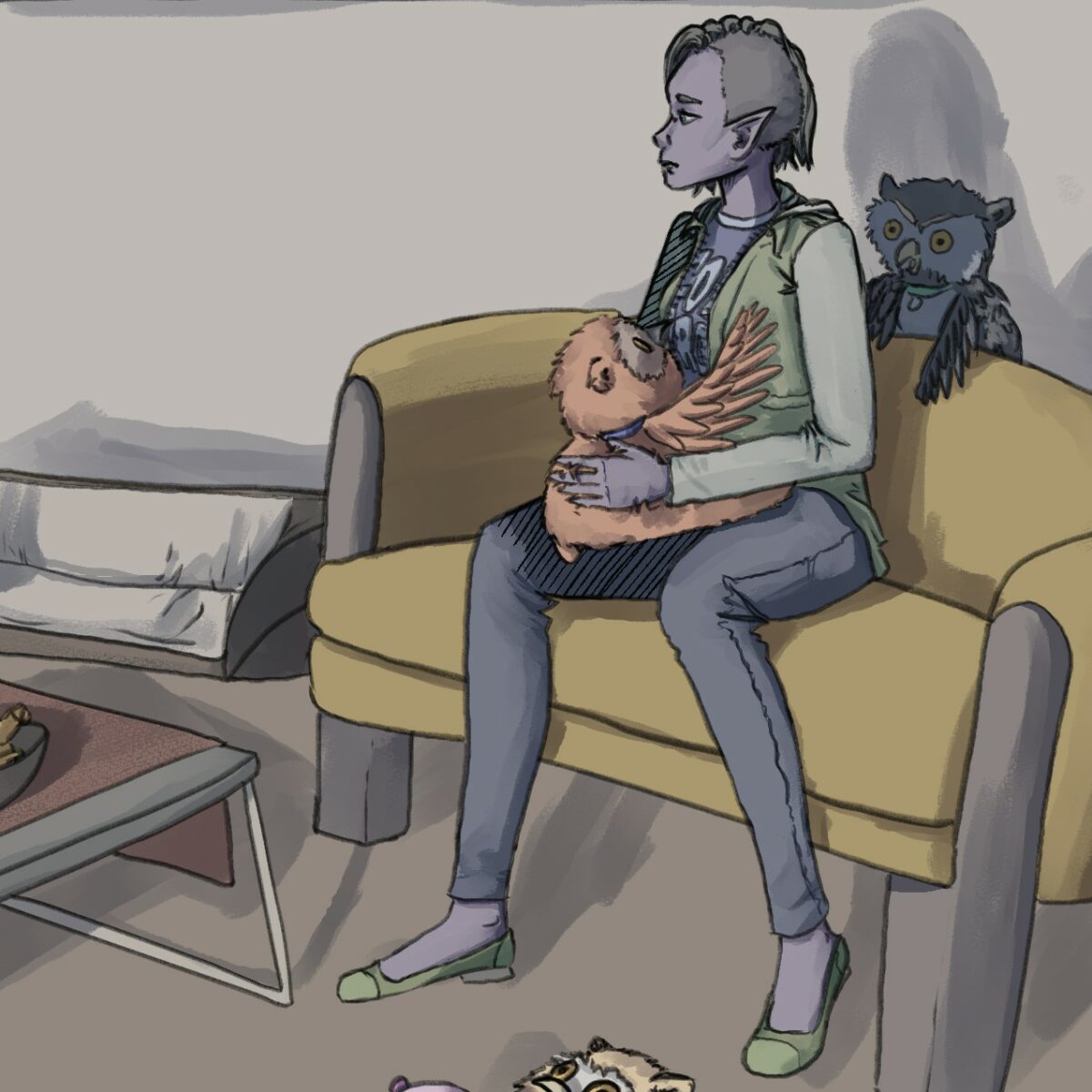
Why. Not. Hug. Baby? 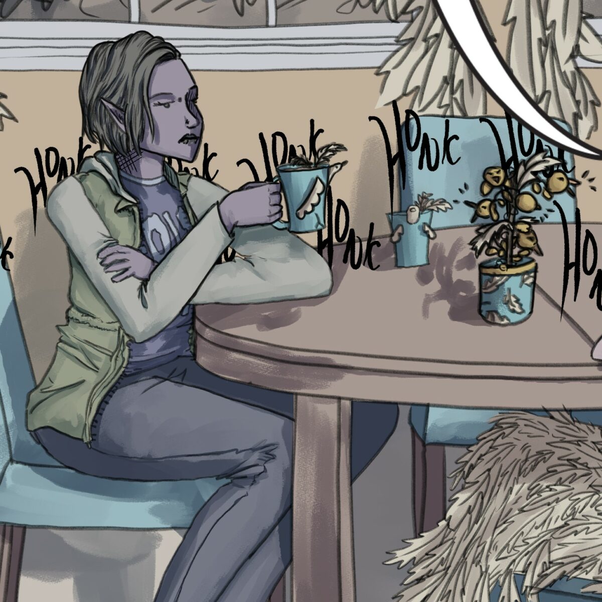
I’ll drink this tea, but I’m not gonna like it.
4 HIGH SPEED CHASE
Really gets the adrenaline going, yeah? This gag was I believe where this comic began it’s life. Olive gripping the tricycle handle like they’re revving a motorcycle, and noodling on after a riding lawn mower.
I got to try the many image action panel again, there at the bottom, and I really like how it turned out. I like my use of the panel break, and contrast background.
and of course more lettering fun with OH no you don’t.
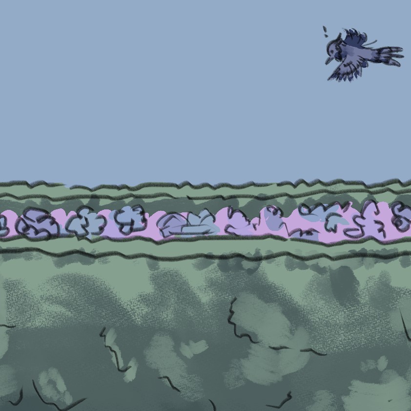
Blue jay finds a worm! 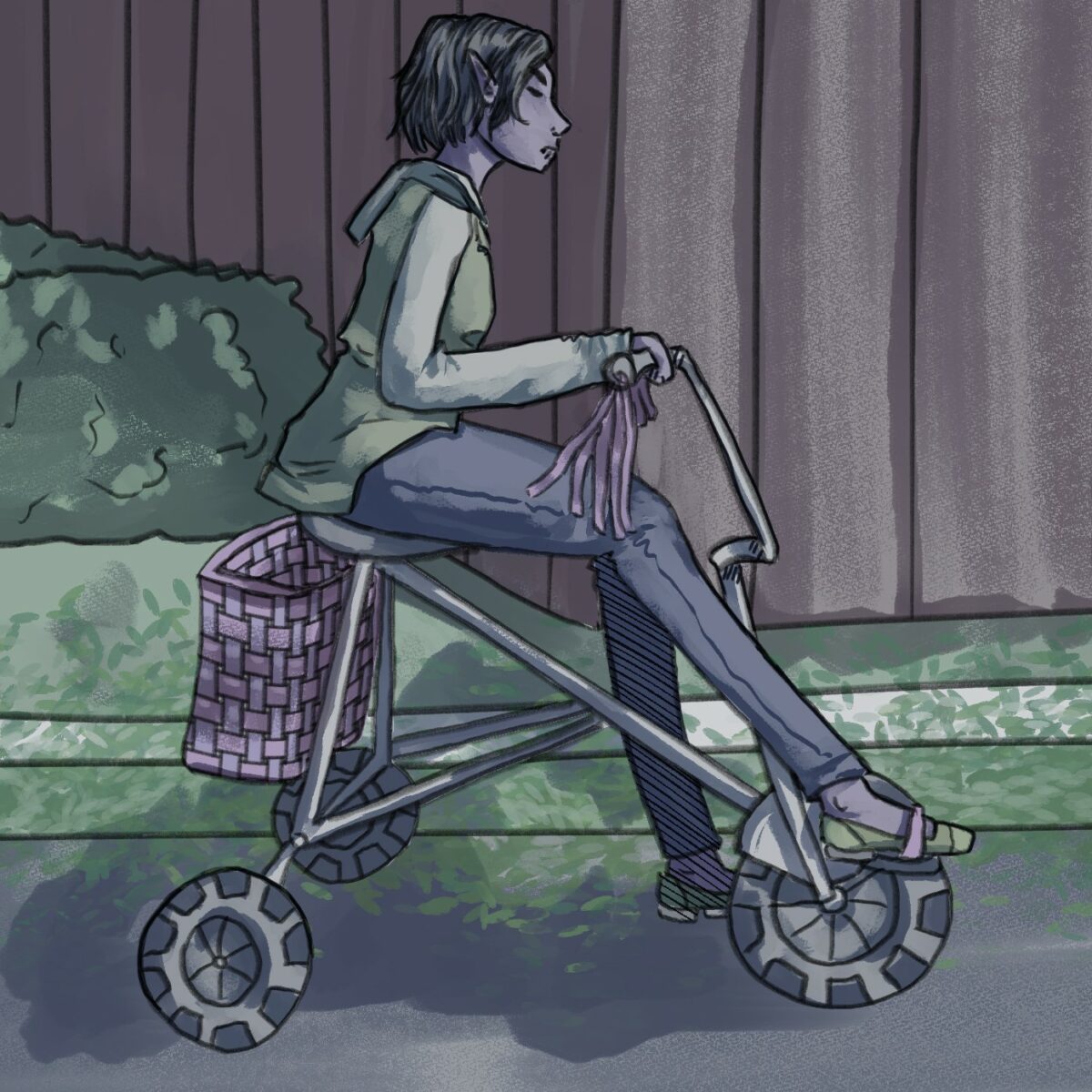
I’m on the edge of my seat here. 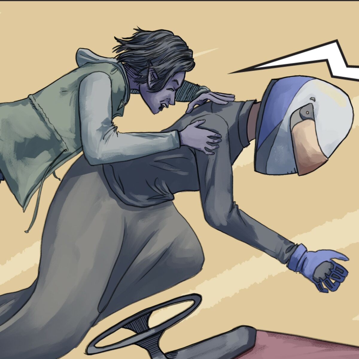
Got you!
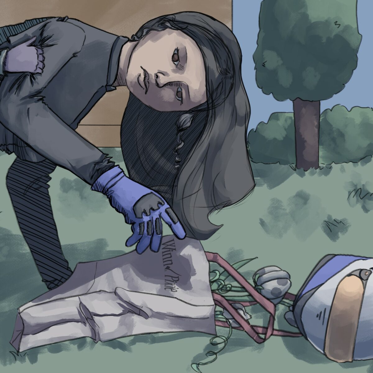
5 Mona’s Garden 🌼
Mona’s garden here was so much fun. The fire mums literally on fire, the golden gooseberries propped up on sticks like vines, and of course, Mom’s glitter orchids. Maybe not the most artfully designed garden, but give her a break, she’s been a painting for like 500 years. Just be glad she knows about helmet safety.
And the last little peek into the Peaseblossom house. I really enjoyed getting to do the same kitchen, but smaller and more abstracted. a lot of fun.
And as our Trickster pedals out into the night, we must ask ourselves, what is an Olive Peaseblossom comic without a little theft?
Mona Lisa: No Eyebrows, No Regrets 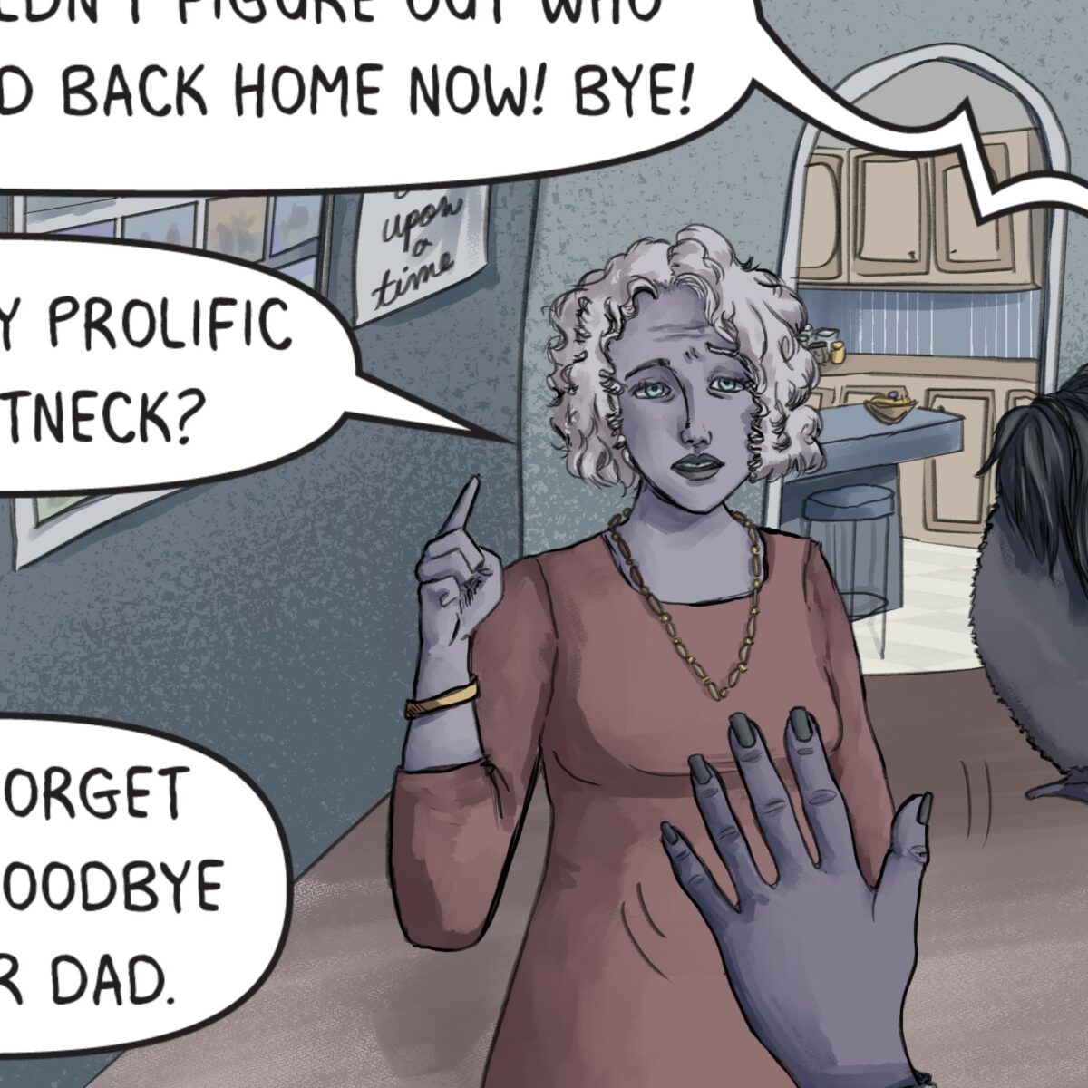
“Once Upon a Time” the “Live, Laugh, Love” of fairy 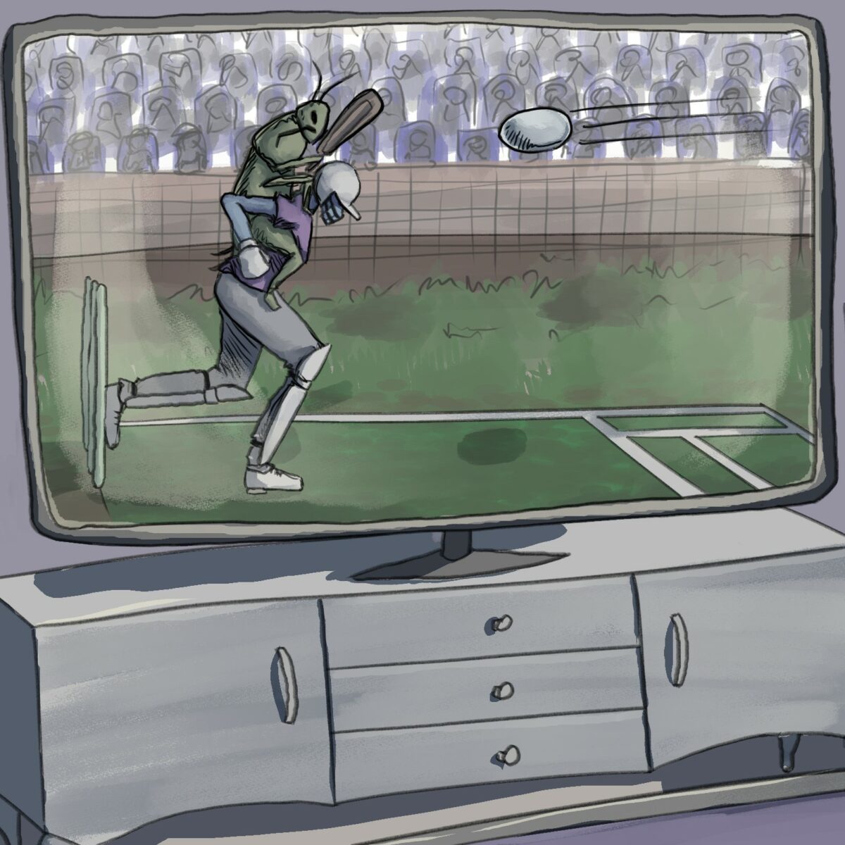
Fancy a … game of, uh… Cricket Jousting?
In Suburbia was drawn in Clip Studio Paint, and lettered in Adobe Illustrator.
Next up for Olive: Have Them Fight God