These were done after In Suburbia, but before I started on Have Them Fight God, as little micro-tests for my process. I’ve been leaning toward a similar style to In Suburbia for the next, much larger, comic project. I told El I was going to do a few single panel process studies, so naturally the next day she hands me a script with six of them.
So, six single panel comics it is. Each done from start to finish by themselves, instead of doing them in rounds together like with the previous 5 pagers. Practice, but make it funny.
Since these were process studies, my artist’s notes will have process notes! maybe it’ll be interesting?
1 BE THERE!!
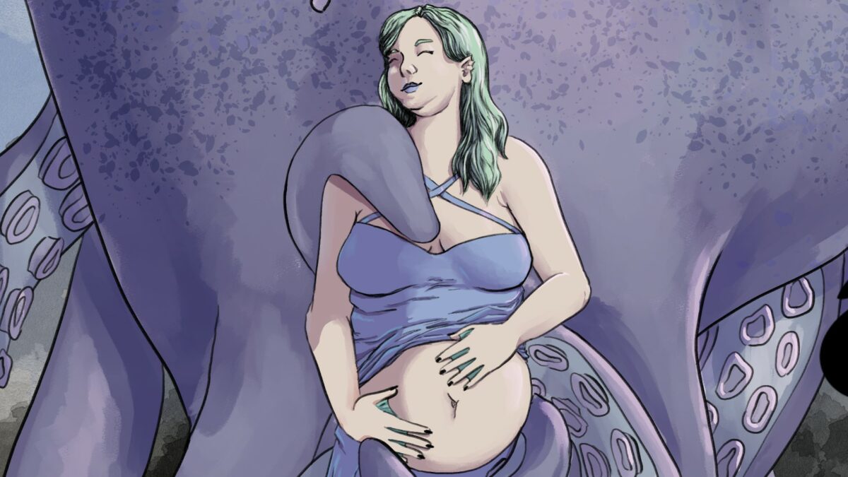
The Species Reveal Party invite is a joke that El had been hoping to work into something ever since we finished Kraken. I think she just wanted me to draw another smitten Kraken, tbh…
Process started with the lettering, in Adobe Illustrator. There was no real blocking out to do, since it was a card with a photograph attached, so the blocking was just as easily done in Illustrator as I designed the card, and I could worry about the drawing completely afterward. There were a lot of revisions here, because I am not a graphic designer, and these are not my skills. Not to mention that gender reveal invite cards are awful and I hate them. Ultimately I decided to play to my strengths here, and made it a card that the Nenenore had made out to Olive. The threatening scrawl “Be There” and Olive’s name written in the card feel like they take the focus off of my card design and into the joke a bit more.
Once I had the ‘card’ part done, I could focus on the photograph.
Step one, then, was blocking the photograph. I did the Nenenore’s pose reference in Flex, and did my rough block in Clip Studio.
I tried doing the pencils with an ink brush at first, to make flatting easier on myself later. Flats were extremely time consuming on the uninked style I used in In Suburbia. I found that miserable, scrapped it, and did pencils with a pencil, drawing what is, in my opinion, one of the best faces of my career. I just really love the Nenenore, and I especially love her here. I decided to do a details light pencil, and to use a very dark pencil line, instead of the lighter, softer pencil line I used in In Suburbia to see if that would help with flatting — it did.
Flatting was next, and I was able to mostly use the automatic selection tools available in Clip Studio. Anti-aliasing off, setting the pencils as my reference layer, and that lovely auto fill. Finishing that up with an aliased pen tool was really smooth, actually. I messed around with the colors a bit, and decided to take everything down to a lighter shade before I started the next step. I really think that uninked pencils work better with softer colors, and don’t quite like taking the vibrant colors my instinct goes toward.
Then detail pencils, using a softer, lighter pencil tool, I did things like the wrinkles in the fabric, and the hair. I always feel like I want to do more at this step, and I tried a few hatching techniques here, before deciding that they all both took too long, and weren’t adding enough to the piece.
The Kraken was colored much the same way that I colored In Suburbia. With a big color-mixing brush, and on a hard light layer, I blocked in the shadows, and smoothed them out, repeating with finer, sharper shadows, and going back for the pink highlights to really make her look wet.
I love the color mixing brushes, but when I try to do a lot with them, I find myself fighting with the tool, and compensating by using more pressure than my already injured wrist prefers. They work beautifully for a whole painting, or for very large areas, like Claire here, but are frankly just frustrating for everything else, pulling the colors from outside of my selections in, or worse, the alpha.
At this point I spent like … 3 days trying things for the Nenenore. I will not catalogue them all here, but there was despair. The Nenenore was finished with a hard light layer, and the lasso tool method, using the color mixing brushes, and then the watercolor brushes with the paint load turned down, (with the same two brushes cloned in my blending tools section with the paint load turned off)
Secondary light source went in next, the light blue on Nenenore’s right, and the pink on Nenenore’s left, with a paint brush directly.
The drawing needed deeper shadows, still. Historically that’s a rabbit hole that leads to working too long on each panel for too long, so I wanted to resist the urge entirely. I tried adding pencil in these areas, hatching, shading, and pure black areas were all tried and none of them felt like they worked. I ended up doing a second deeper shadow pass, but only very lightly, where it was needed, and almost entirely with the lasso tool.
Watercolor wash back ground, and fin.
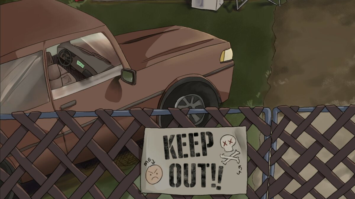
2 An Even Trade
I’m not gonna lie… Oleander might be my favorite character in this series. He is just… baby. I love his over the top, probably performative, anger, and his tendency to just doodle on everything. He was a lot of fun to figure out, and a lot of his design and feel were my own touches on the scripts.
For this one, I decided to do it as a background and setting heavy panel. I love Oleander’s junk yard, and I will need a work flow that works for those, even if I find them a touch intimidating. I decided to try splitting my layers not just into (top to bottom) pencils – details – colors – flats, but to do a set of those each for foreground, mid ground, and background elements. So, for example, the tall grass, tree, and fence are all the foreground.
I did this because, with the characters in the mid, I often find overlaps frustrating to work around. And with that fence, boy does it have some overlaps. If I flat the entire foreground literally on top of everything else, I don’t have to worry about crossing lines behind it. This also gives me the opportunity to fiddle with my major elements in the mid and background after I’ve drawn them, to make sure that I like where they fall behind the complicated objects. I often work better by almost sculpting my compositions, so this works very well for me.
So, to that end, after blocking out my characters with boxes and vague shapes, I took the lettering to Adobe Illustrator, and began on my foreground, doing pencils (with a softish triangle pencil tool, this time), and flats (with sharp aliased edges) before I moved on. After all three sections were drawn and flatted, I made one layer that was a copy of all three flats layers together, sat it underneath my whole piece, and made it my reference layer for using the wand select tool during my shading process.
Also, in what might be an absolutely obvious life hack, for this piece, I decided to do only my biggest shapes in a different layer than the pencil line details. So Olive’s face, the lines in their hair, cloth wrinkles, many of the lines on the trailer — all on a layer of their own. This was a big success for me, and I had a lot fewer little broken bits of flatting to fix after the wand tool did it’s best guesses for me.
Shading and lights were done much like normal here, except I ended up deciding here to do a painted background for his back fence, and the sun set. I painted that and then lined rather messily on a layer in my background folder. The rest was done with a combination of lasso fill, and paint brushes, using the tools I tweaked for myself last time, on a hard light layer. Instead of having a few set colors for shadows this time, I experimented with picking for each item, by using the hue slider, and keeping saturation and value roughly the same. Some deeper shadows were used, mostly on the figures and the car in the middle ground, with clip to alpha as my friend.
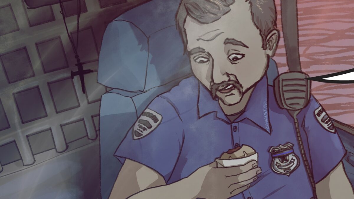
3 This one’s for you, Jim.
Our bike riding barbecuing biker gang is the gift that doesn’t stop giving. The dubious diner here was very roughly based on my abusive cop father. Please enjoy the thin blue line band covering up this asshole’s badge number. ACAB
My cops were blocked out in Design Doll with huge cubes to block in the seating, and set up my folders as with number 2, in three folders. I think that bit of organization is actually pretty good for me, even if it does cause a few hiccups on it’s own. Being able to set all of one depth to display in blues with a click of a button is nice.
A note that El gave me before this one was that she thinks I might be over shading my work. So, I desperately tried to do a simpler, hard edge shadow on this piece, for the figures, and to simplify and leave things out. I still ended up blending out some of the hard edges in a few places. Other than that, I did not vary my work flow from the last one. Something’s still not quite right, but I’m having a hard time putting my finger on what it is, or how I should be correcting for it. I think it’s time to try something very different, and see where it pulls me.
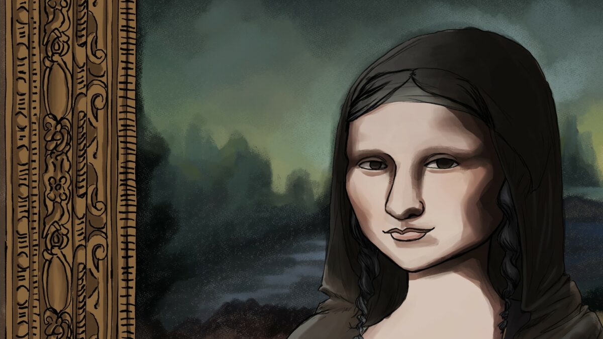
4 Sweet Homecoming
This one was simultaneously a blast, and a little frustrating. I hadn’t really designed Mona with the idea of putting her back into her painting later. So, when it came time to color this piece, I had decisions to make. Did I line art and comicify the background of the painting? Or did I painterly up Mona a touch. How do I painterly up the style without losing what makes her look like the slippery and silent woman that our Olive stole? I do not know if I hit my goal.
Also, this penciled style has been using very light, almost pastel color. For some reason that has tended to make the pencil look better after shading. Pencils plus flats look fine with vibrant colors, but when I start adding in shading it was swallowing the lines whole, and I want those lines. So, I’ve been making my flats lighter than I would usually do by a lot, and getting my contrast back.
But the Mona Lisa is a very dark painting. Mona is pooled in black shadows. Her entire lower half is gone to them. It’s what make the painting as captivating as it is as a composition, so I didn’t really want to pastel it up. I think it worked out, ultimately.
Some of this is aided by the fact that I’m using a darker pencil than I was for In Suburbia. I tried using a few roung ink pen liners for my pencils, but ended up missing the scratchy pencil marks. The frame was done in vectors, simply so that I could copy and paste each motif instead of drawing endless copies of each of them. My computer was… not emotionally prepared for that many individual vectors, but I talked her through it with a minimum of reboots……. I regret nothing.
For detailing, I experimented a little with cross hatching again, finding that while I really love them in things like cloth, I find them overwhelming on soft body surfaces. That’s probably a fine thing. I know I do not use a lot of black in my ink work, and I never really have. It’ll make Have Them Fight God an interesting experiment, I’ll tell you that.
The blacks and deep shadows in the rendering on Mona here were done at the very end on it’s own layer above everything else, pulling a neat trick of doubling that layer, turning them both down very low opacity, and setting the bottom one to overlay. That helped the reds and oranges in the shadows pop, and was a very fast last touch.
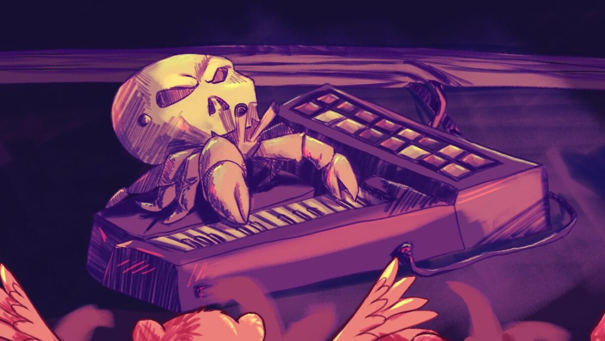
5 Fine Swine
Our Wic Div homage. El wanted to see Skull crab again, and this big crowd scene seemed like a good thing to test myself on. Composition with that many figures was a blast. I tried to make a circle of lines, hands and pointed fingers to guide the viewer through the panel. I admire bright color work like I got to play with here, but I’ve had trouble making it work for me.
This one was drawn roughly like I’ve done the rest, using my new foreground, mids, background folders system. The blob crowd interspersed as single layer in betweens. The real experimenting here came in the shading. I had club lighting to play with here, so I felt a lot braver to experiment.
A thing that has been bothering me, is with the rough lines, which I love, simpler shading methods, like the lasso, and it’s hard edge always felt out of place. A more painterly style is always going to be my default, but that is overwhelmingly a lot of work for a regular sized comic. For this one, since my line work was all done in pinks* usual methods of hard light or multiply layers were making shadows darker than my lines. So I backed up, never having been super happy with those methods anyway, and selected the line color, on a normal layer set to a low opacity, and roughed them in with my trusty triangle pencil. I loved it.
I wanted those to be a touch more dynamic, so I duplicated that layer, and locked it’s alpha, and applied black to pink to purple gradient over the shadows. Low opacity, again, and soft light this time. It brought the deeper darks at the bottom of the page where I don’t want the viewer to linger, and gave a nice club lighting feel to the piece.
Another normal layer for pencil highlights in blue and yellow and pink. Those getting a little smoothing where they needed it, and I was loving it.
*At first I was using Clip’s handy feature that turns all the work on a layer a single color to tint my lines, but that is more trouble than it’s worth. When I was experimenting with doing color holds on the shadows, that got pulled into the layer by coloring the lines themselves with alpha lock. I was overthinking it. I do, however, use that feature a lot while I’m sketching so that I can quickly tell which layer I’m working on. ADHD hacks!
After finishing the piece, I felt like it wanted deeper shadows on the stage. I tweaked my color choices some, but the neat thing I ended up doing was adding a deep blue overlay, that I removed with an eraser to make spot light on the stage. I really liked that reverse lighting style, and may use that trick again in the future.
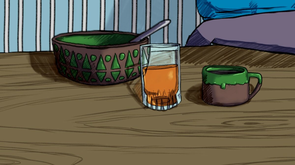
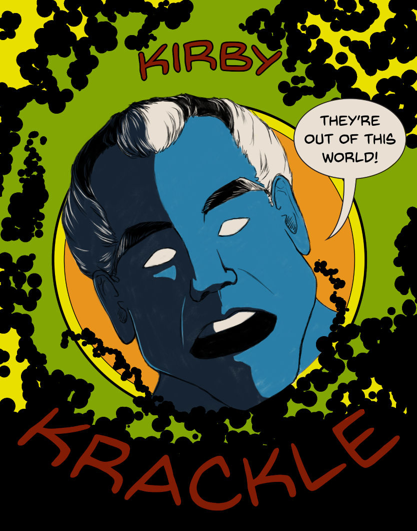
6 A real cliff hanger!
This one is a prequel, of sorts, setting the scene for the next, and last, Olive piece. Wow, am I ever going to miss this trickster.
The process here really was just a continued refinement of what I’ve been doing. The Kirby Kackle box was done in an homage to Jack Kirby’s style, and this whole panel was supposed to be that as well. I just … I don’t like doing it. I ended up rendering the scene in inks, and I feel like I lose so much to it, mostly in my faces. Eventually I will need to address this limitation of mine,but in the meantime, I am creating art that I’m pretty proud of.
The Kirby Krackle is definitely stylistically a little more constrained, and some of that will be used in the upcoming comic as well.
For the up close you’re getting that glass of orange juice. A thing I love to do, is disconnect my lines where they overlap with glass. I love how subtly that kind of detail can make a space feel more dimensional. I really love the effect the sketchy color fill gives the bowl and glass here.