Oof, so much to say and to feel about this one. This was Olive’s last big adventure, at least for the foreseeable future. That is definitely a bittersweet fact. These were a warm up project, as I learned how to tell stories as comics. I have drawn literally only 21 pages of comics in my adult life, and they are all Olive. Romping literally around the galaxy with this Loki blessed goblin has been so meaningful to me. I really love them, and I really love these comics.
And I have learned so much. I tried things that were ridiculous, and things that were too big. I went bold and made a few missteps, and learned from them. A few times I went just a little too timidly, and I learned from that as well.
I have learned that I have an absolute passion for story telling. For layouts and formalist touches, and oh god do I love lettering.
I’ve met comics professionals, and critics, and they are literally the most welcoming, helpful, and warm professionals in any artist community I have been a part of.
I am … I am standing here at the end of twenty one pages, looking down at my next project — the first issue of which will more than double my page count — and I am feeling blessed. I am really excited to introduce you all to the world of Britain a Prophesy. I am doing the best work of my life, and I am just completely full of love for this work.
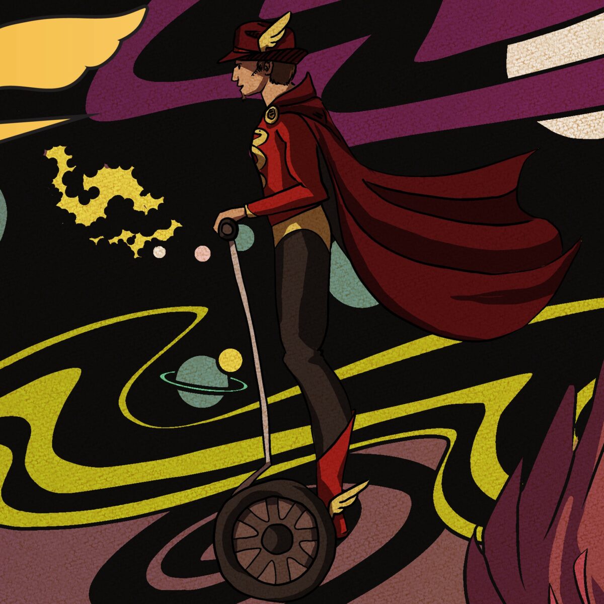
Right, ok, so Have Them Fight God! After taking Olive incredibly small — a visit to their parent’s home in the suburbs — El wanted to take them cosmically large. So, literally to Jack Kirby’s fantastic space with us!
1 THIS IS VERY BAD
The visual language of this comic was very fun to develop. I had settled on this sketchy un-inked style for Olive, largely because I hate inking, and well, Michael Zuli makes it look so good in his work.
A thing I find particularly interesting about my own comics work, is that while I tend toward very clean story telling, and art, I really really love a messy line. So many of my comics art heroes use clean, heavily inked work to stunning effect, and I pull a lot of my style influences from those artists. I wear my McKelvie influence on my sleeve, whether or not I want to. But I’ve found I lose a lot when I try to ink my own work, and I find the task frustrating.
Of course, I’m doing what is often as many as four people’s jobs here with Olive. Professional inkers are professional for a reason.
So, with Olive solidly with their pencil and sketchy shading look going so well for me, Kirby-space clearly needed to be inked.
Everything that is Olive’s is in their style, so that’s Olive themself, and the ‘borrowed’ space ship, the Golgonooza. Everything else, save the monster at the end of this book, is what I’ve been calling Kirby Space, and it’s been inked, and very flat shaded. I’ve added a weathered paper texture to those areas to further set them apart. The effect is pretty subtle, but I like it, and it sets us up well to introduce Yx later.
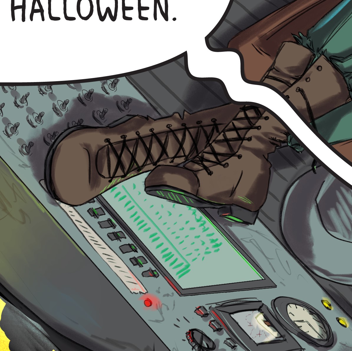
maybe you should be paying attention to the ship, Olive? (I really enjoyed this console) 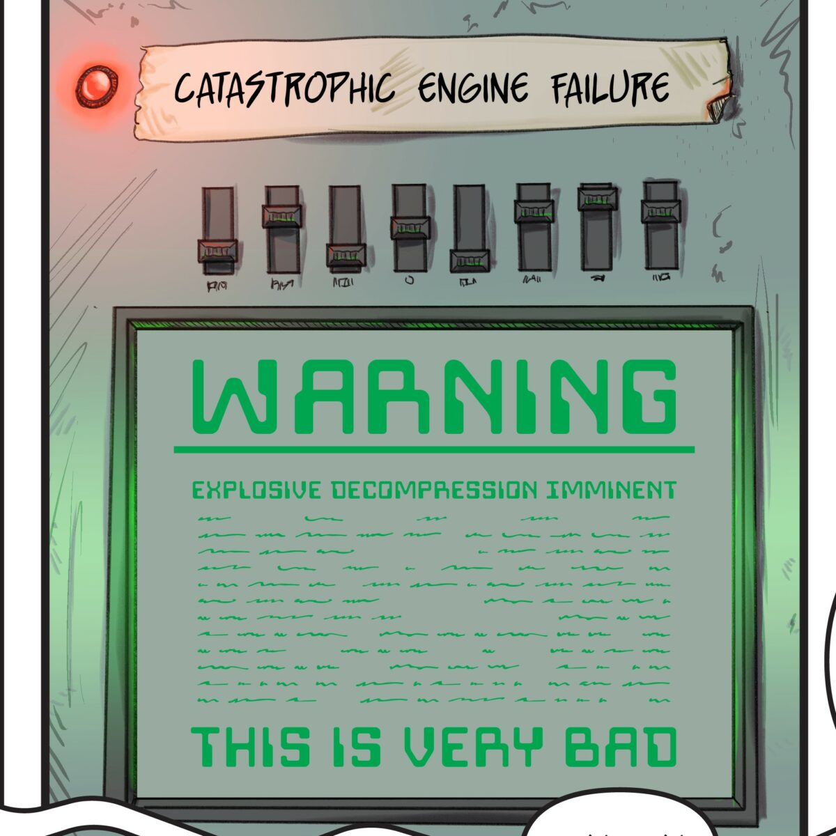
This bit of lettering was a blast. I love having Oleander scribble all over his ships, so the taped over lable with a hand writtencryptic warning delighted me. 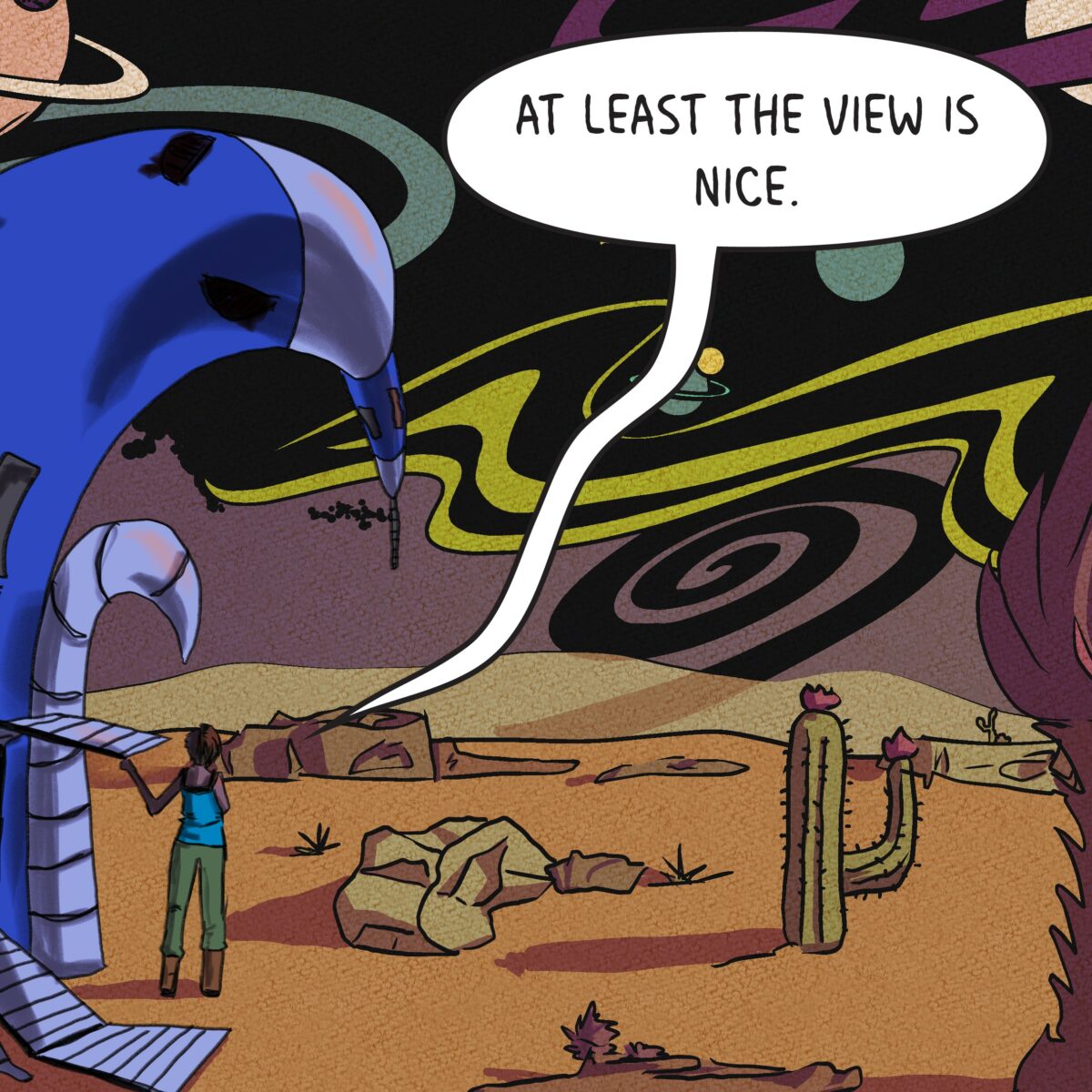
there was not a desert planet in the script……… I just really love deserts.
2 HOLOP OPOLO LOBOL OLOPO POLOH!
Have Them Fight God has three characters, each with their own art style, but also each with their own lettering style. Hermes’s bubbles were a delight to design. I wanted him to /sound/ annoying on the page, as if you were listening to a sentient fedora try to explain your own job to you. His lettering is obnoxious and I adore it.
Designing the Kirby tech was one of those things that, when presented with the task I was completely intimidated by, but when I figured out how I wanted to do it, I actually really enjoyed myself. The ship was a delight.
I do break the Kirby Space is entirely flat shaded rule here for the panel with Hermes’s Book of Abremelin magic square incantation. I want to really sell that the magic is itself otherworldly. The spell, by the way, translates roughly to “to fly in the air and travel any wither.” per El’s script:
“so that should probably influence your design a bit because obviously it’s very important that we make this joke read correctly to all 0 of our readers who will get it.”
Have I mentioned that I love working with this woman?
Aaaaand, here he is. 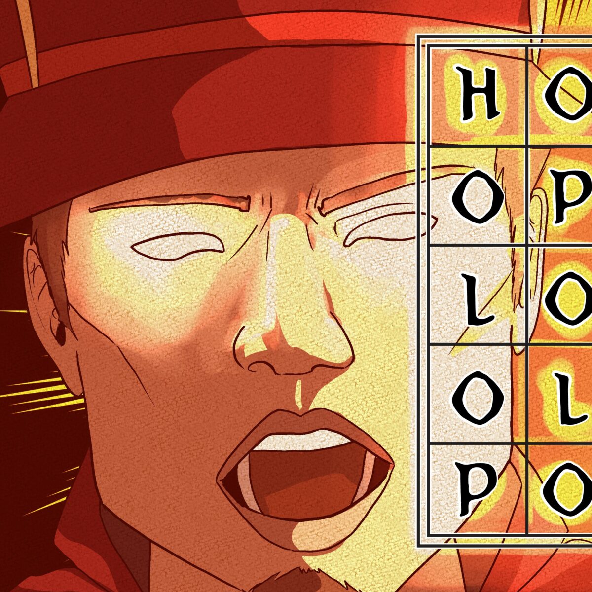
he scream at own ass? 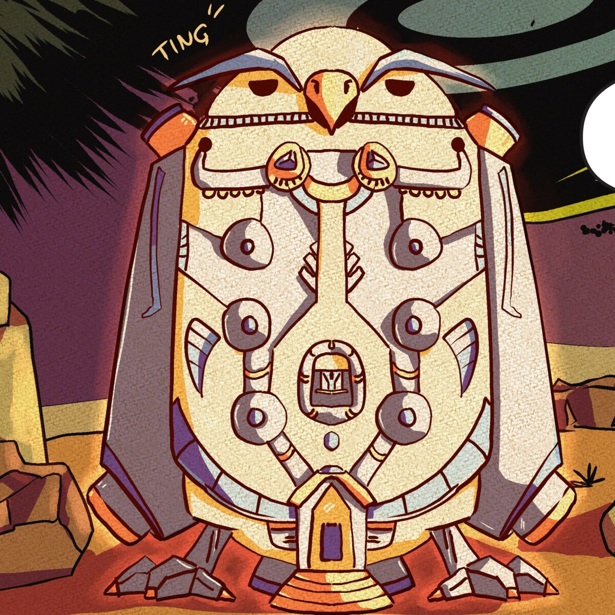
what do all those tubes do? they look cool, that’s what.
3 DO A BARREL ROLL!
I had a lot of fun with the acting in this panel. Olive’s emotes are all big and over the top. and Hermes is a smug shit. I love him, he’s awful. This is the page where I decided I wanted to do foreground elements in black. I didn’t come to the white sketched lines over them until the last moment, but I really love the effect it has, and I am going to see if it fits as a style in any future work of mine.
We also have more flying through Kirby Space, which is an absolute blast to design. It will certainly never be a thing I find occasion to do again, but it’s delightful in it’s simplicity and general brightness.
thanks but uhhhh… 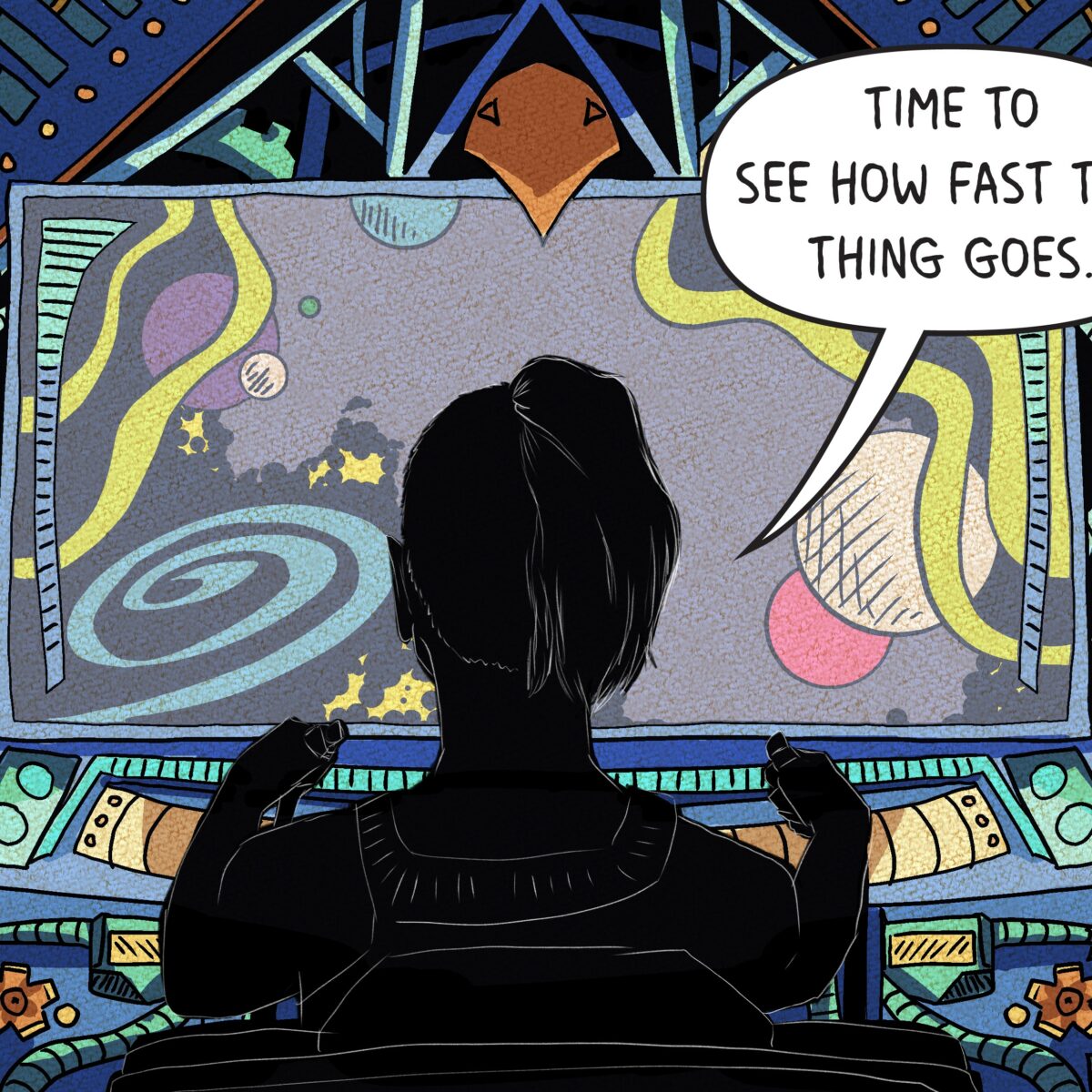
what do all those knobs do? They look cool, that’s what. 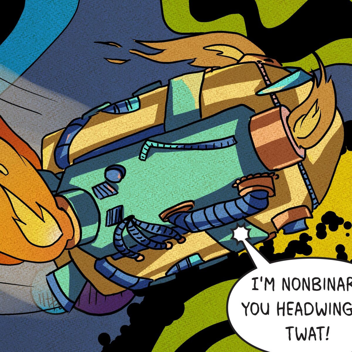
did I mention that this ship was a delight?
4 CHICKEN NUGGIES
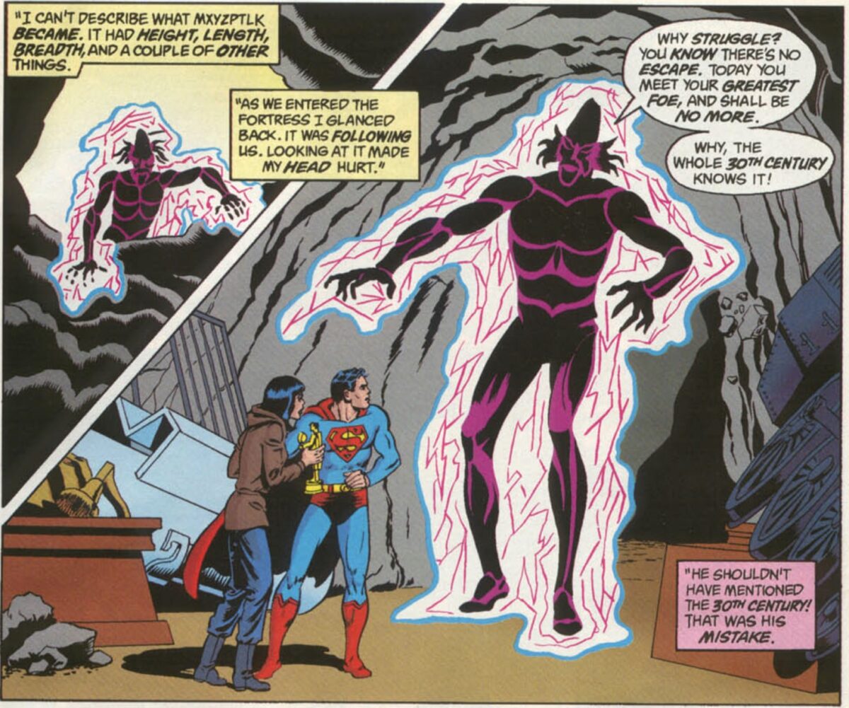
This comic was born out of the gag of asking for NUGGIES in household google chat with zalgo text, and a panel in Alan Moore and Curt Swan’s Whatever Happened to the Man of Tomorrow in which Moore has a caption reading “I can’t describe what Mxyzptlk became. It had height, length, breadth, and a couple of other things.” Curt Swan responded by drawing a glowing energy creature.
Here’s what El give me in the script for our dear friend Yx:
There is a terrible fragmenting of the basic fabric of reality as YXAACTETH THE UNNAMABLE turns itself through seventeen dimensional space to gaze upon this dimension. Its form is beyond all reckoning and comprehension, as if one attempted to compress a seventeen-dimensional jellyfish into two-dimensional space with no loss of detail.
YXAACTETH:W̸̡̲̣͈̺̮̠̩͈̫͐̅̅̄͗́h̷̡̢͇̩̳̫͙͍͍͖̳̹̹̞̜̔̒̔o̵̼̗͑̈́ ̵̮̺̐̓d̸̢͎͔̝͎͔͚͇͙̤̠̯͎̔̽̇̑́̃̂̓̓̎̍̈̅̚͝ͅͅį̴̡̩͈̮̰͙̪̮̗̗̜͍͙̀́̍̆̈́͂̅͝s̵̢͉̬̞̰̈́͆͂̾̑̽̆̃̃ţ̷̩̘̪͓̺̞͖̼͙͛̓̑́͛̅̆̆͑͘ư̷̖̼̪͈̹͇̈́͑̏͒̆̿̑͛́̏̃̔̕͝ͅŗ̶̱͓͎̖̮̃̓̾ͅͅͅb̸͎͎̜͐̑̑̒̅͘ș̷̨̡̫̞̟̺̩͂́̍̒̔͌̕͝ ̵̢̧͎̺͇͚̌͊̑̉̔̕̚m̴̰̰͇̓͐̔̋͐̇͋̋̀̂̈́̉̐͂͜͝ͅy̷̨̼̺̟͖͙̦͕̼̓͂̆́̐̍͗̉́͠͝͠͝ ̷̺̿̽̿͠ṡ̷̛̥͈̖̹͈̩̰̩̫͆̿͑̔͌͊͋̂͐̄͝l̸̲̏̄͗͐̃̌͐́̉̿́̏͝͠ư̷̢̛̱͎̠͙̰̠̥̅̊͐̓͂͛̿͠͠m̴̡̘͚̥̖̮̖̝̟͋͐̊̉͘͜ͅb̷̡̻͔̗͉̯̍́́̒̑̈́͑̾̋͋̚ḝ̷̡̼̭̻͍͎̼̅́̃̐̂̽̂͆͑̋͝͝͠ͅr̵̢̃̍̈́͑̓̌̓͛̆̍͂ ̸̢̧͎̙̲͉̞̩̠̩̹̼̕͝ͅͅe̵̛̮̠͕̼͉̦̣̖͍͇̯͇̦̠̺͌͌͂̾͌̾̾̀̅͐̀̕͘t̷̡̢̧͈̝̻͚̫͈̰͕̫̤̒̾͜͠ę̷̛̹̙͍͎̟̻̱̻̺̺͇͙̜̾͗́̽͝͝r̷̨̛̺̳̱͔̻͓̳̳̟͔̠̆̈́̈̈́̀̈̽̓͘͘̚͜͝n̴̨̘̗͇̲̰͚̻͉̬̙̪̈́̂͊̆̌̽́̈́̇̇̀͠a̵̡̧̱̱̤̳̙͙̗̦̪͕͛̈l̶̫̲̜̼̞̗͝?̷͇̪̙͕̫͛̐̅̈́́̑̕͘͝
Fuck it. You’re getting an eyeball monster.
I did play with the multidimentional concept she threw into her trolling description to design my visual language for Have Them Fight God. There are three distinct art styles in the comic, Yx’s being the most obvious. He should look like he does not /belong/ in the space. He is ripping through reality, literally tearing the panel borders away. Of course he should be fully rendered in the midst of this flat world.
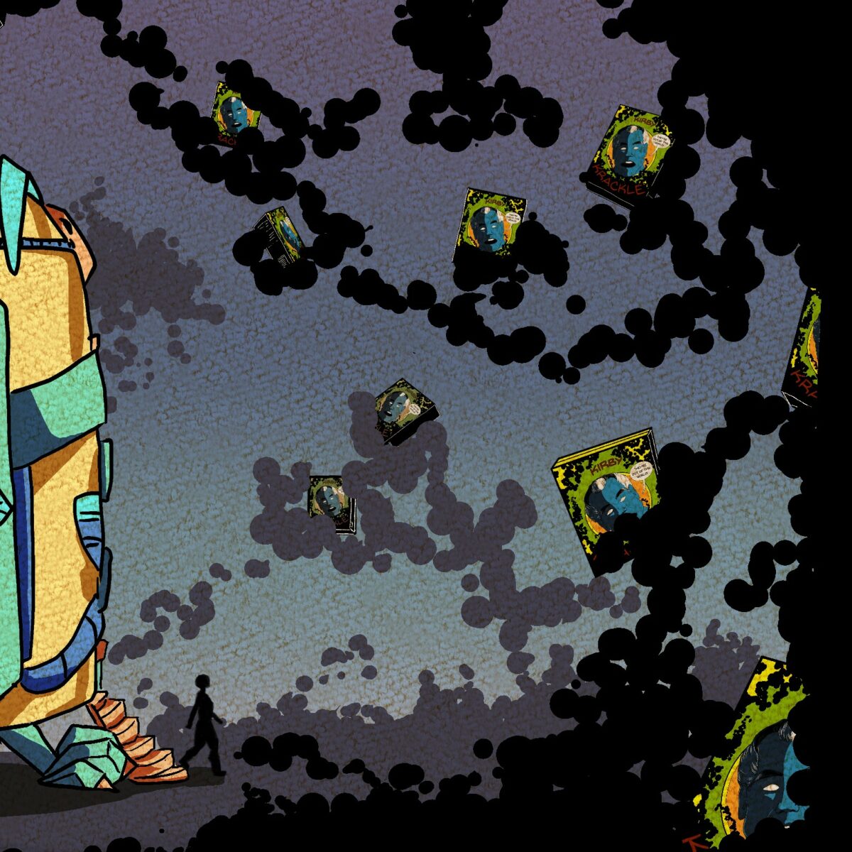
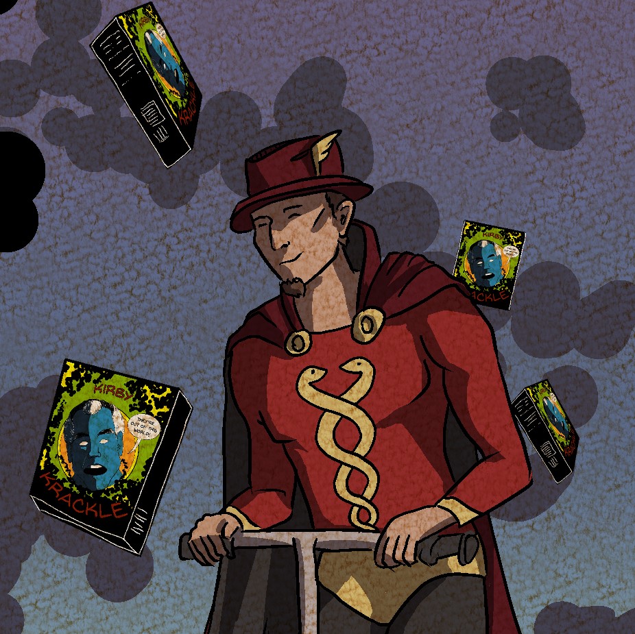
This page also has the Kirby Krackle. We wrote ourselves into a bit of a pickle with this cereal. El originally had them crashing into the Kirby Krackle and scooping the cereal up out of the material of the world into a container that they brought. But in the one panel short that leads us here, I designed a box cover for Kirby Krackle Cereal. I kindof needed a proper cereal box to sell the joke of that short, but it made this script make considerably less sense.
I forget what solution El suggested, but I threw out the one we ended up going with: boxes of the cereal mysteriously floating around in the Krackle. I love a good visual gag, and I really like how this reads. It has the right level of complete absurdity for an Olive comic.
One small step for Olive? 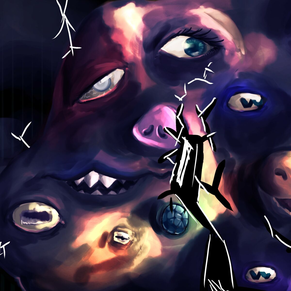
Yx’s eyes and mouths are the only parts of him that move from panel to panel. 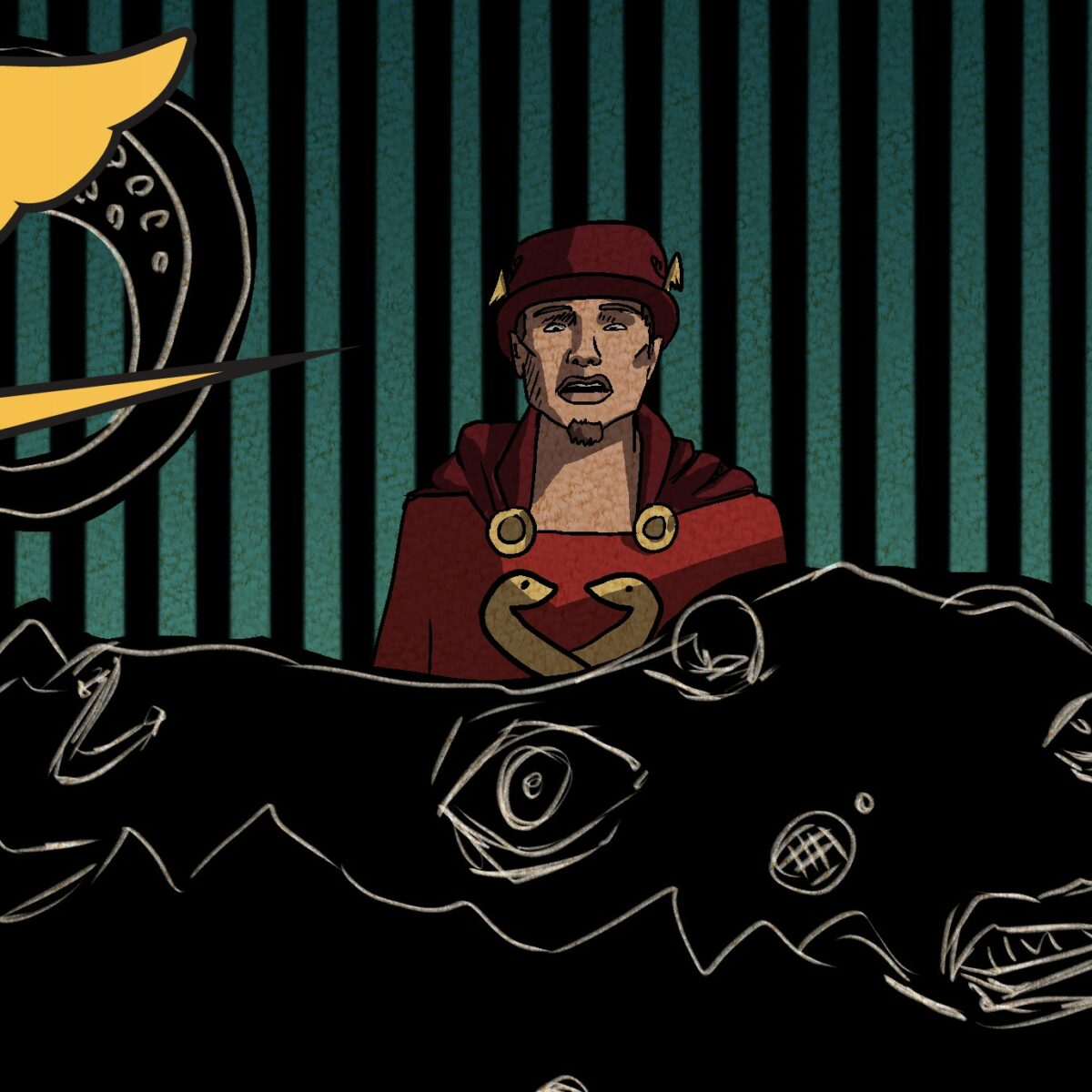
this facial expression, though.
5 Hog City Barbecue to the rescue.
ok, can we talk about Yx’s lettering for a moment? I knew I wanted to try Zalgo text for him, but I had no clue how I was going to make it work. I warned El early on that I would try, but that it might get abandoned if it wasn’t working.
Obviously I wasn’t going to use like… Ariel… so I had a problem to solve. I used a blambot font and made those drippy word bubbles, and it looked pretty good at that point. the Zalgo is all hand drawn. I used a zalgo text generator for each letter to make sure I picked sigils that were valid for each character, and tried to mimic the drippy shape of the balloons with the zalgo.
It was meticulous, and slow, and literally the most fun.
When I first set up the panels, I had Yx’s balloons be tail-less, as if his voice was just booming from somewhere out of space, but decided at the last minute that I liked that sassy toothy mouth a lot, and thought it would be funny to have him talk out of both mouths at random. This was a … nontrivial ordeal because suddenly I had overlapping tails all over the place.
So that took some reworking. I have had fewer problems like that recently. I ran into it a ton in the first two Olive pieces, and kindof figured out that I work best doing lettering almost first — after thumbnails, but before sketches. I have to do a second pass after sketches, to wiggle things around into place, and add tails. Largely I’ve been trying to do each step discretely, without going back and forth between programs, but this definitely seems to work best for me.
Literally the only problem I had was that one that I created by changing my mind. Worth it, I think. I really like how it’s come out.
Smug bastard… 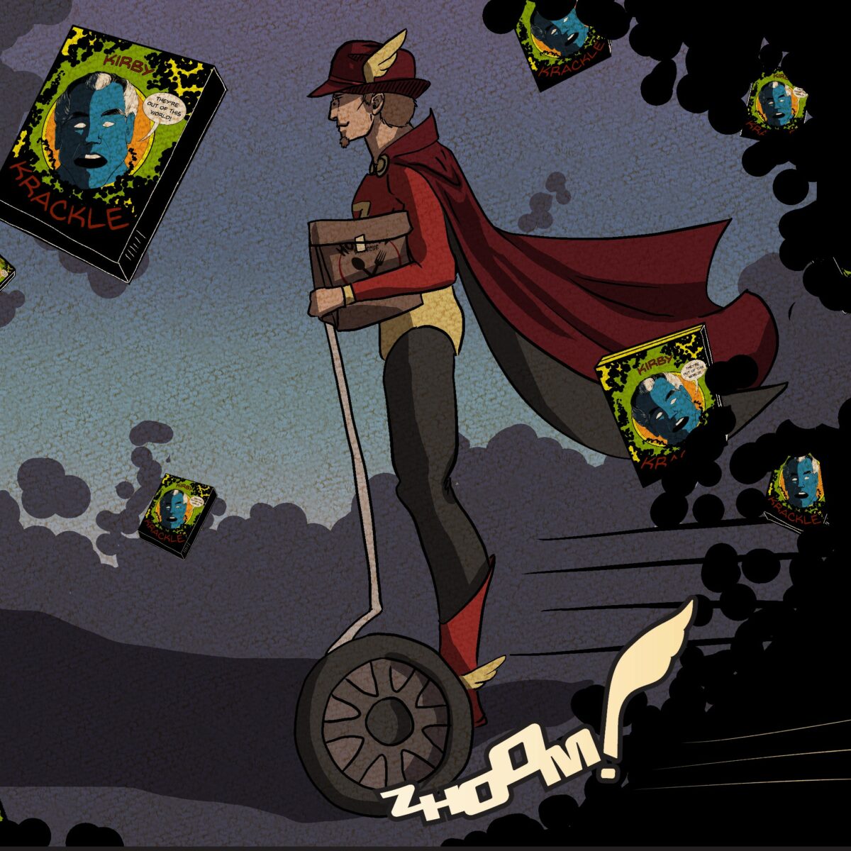
zhoom! 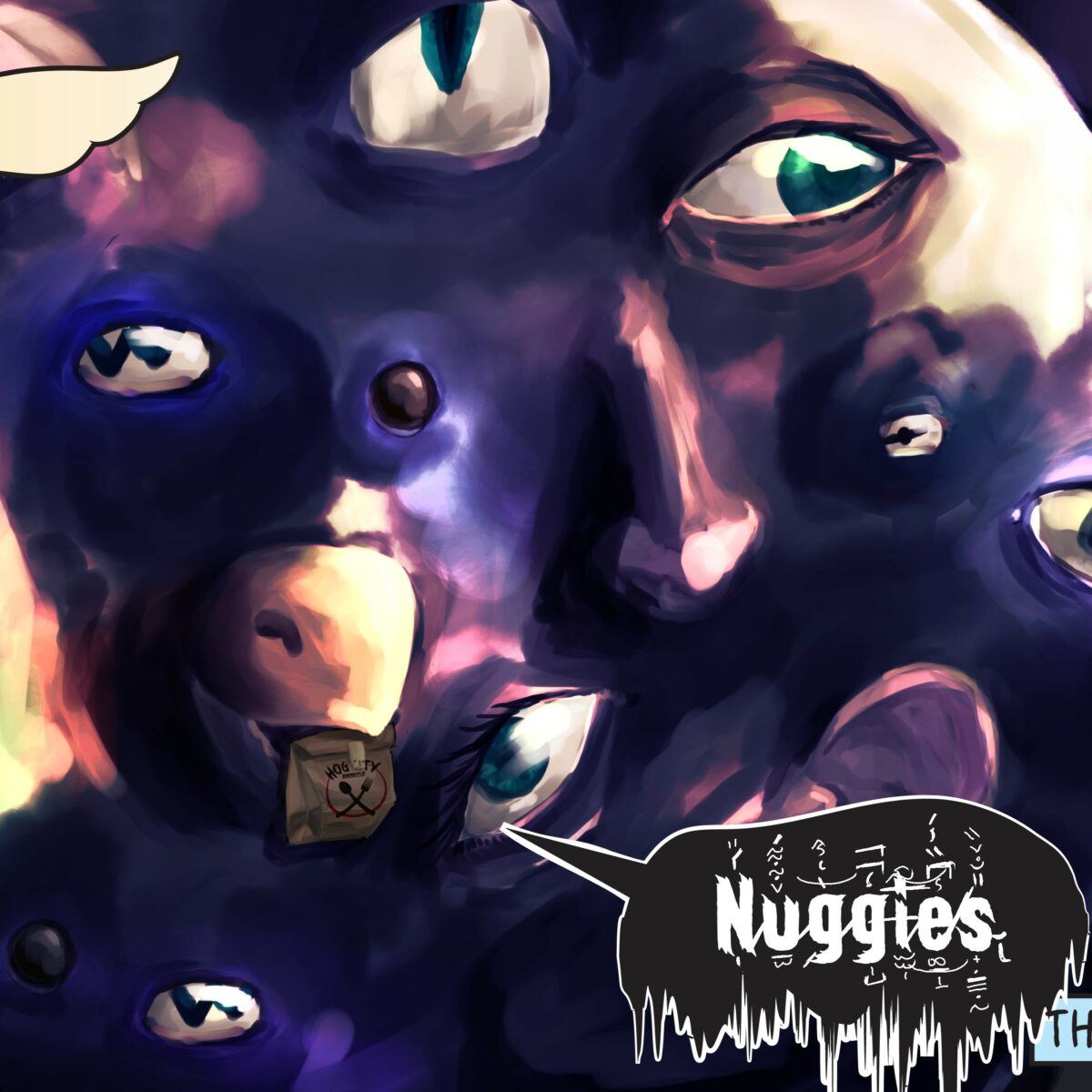
you wanna… take those out of the bag, Yx? No? … ok, buddy.
Next, I’m on to Britain a Prophesy sketches and designs. I’m beyond excited to get that process started. My artist’s notes and highlights for that project will be up on our Patreon instead of here, and while we’re in the early stages of the project, script one is up for patrons of all tiers as a thank you for being one of our first supporters.
Have them Fight God was drawn in Clip Studio, and lettered (mostly) in Adobe Illustrator.
Thank you for joining me on this journey with Olive.